Mobile App & Rewards Experience
Brew Coffee
Brew Coffee is a personal project of mine where I tasked myself with designing a mobile “rewards” experience and app for a fictional coffee shop.
Timeline
Tools
September, 2025
1 week
Figma
Google Forms
Miro
Introduction
As someone who loves drinking coffee (and loves rewards even more), I thought it would be a fun experience to create a fictional coffee company and design an app and rewards system for it. My goal was to understand the likes and dislikes of current coffee rewards apps and design one that reflected a version with user feedback incorporated.
Current Market
The current industry leader for coffee in the United States is Starbucks, with a market share of about 40% as of late 2024 and 16,000+ locations in the United States. The largest competitor of Starbucks is Dunkin', with 9,000+ stores open across the U.S. We are also seeing other competitors starting to grow, with Dutch Bros reaching nearly 1,000 locations and Tim Hortons slowly climbing towards the 1,000-locations threshold as well. For this project, I will be primarily focusing on the two biggest chains in the market, so I will conducting my research on Starbucks and Dunkin’.
User Research
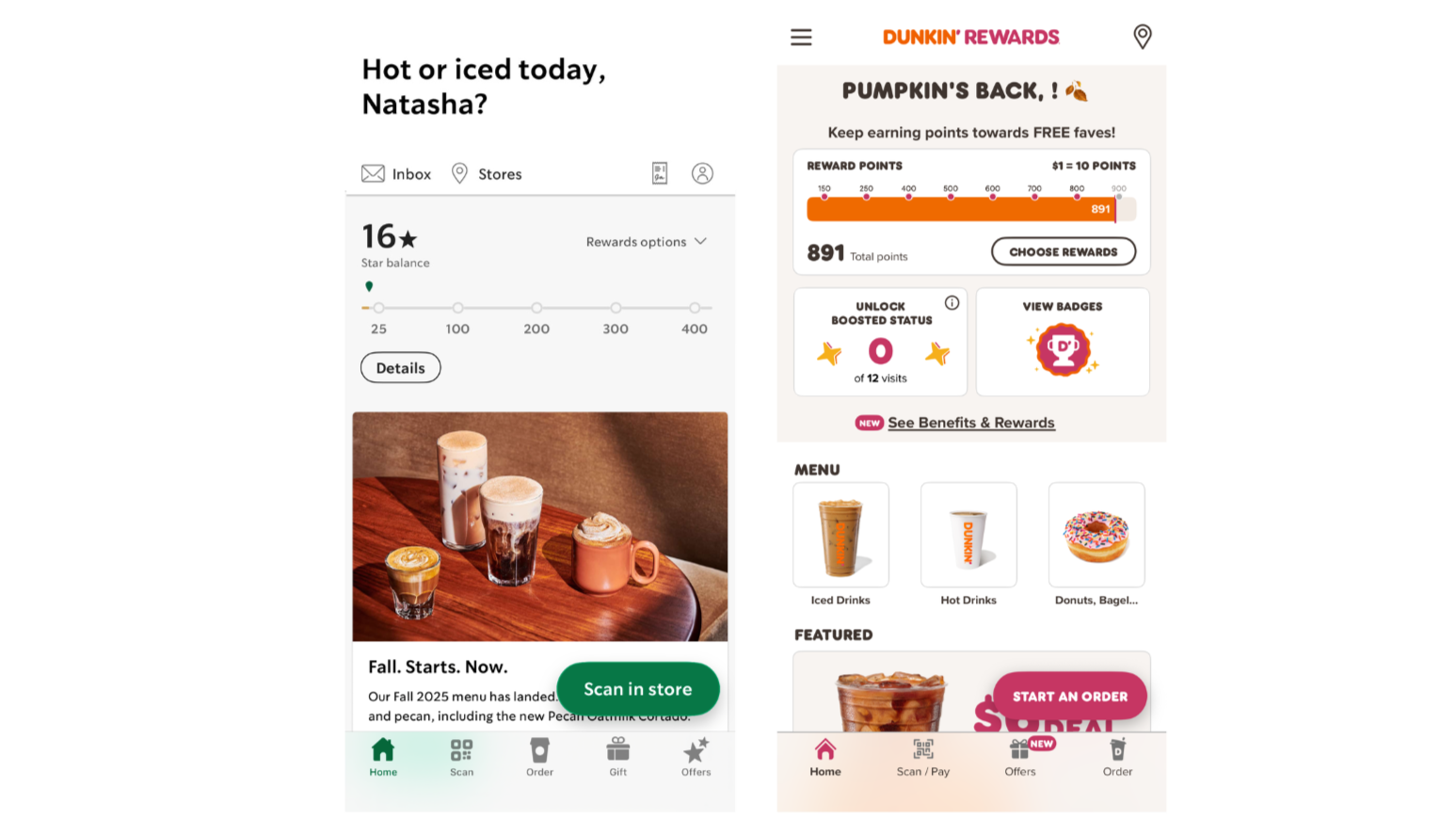
I began with surveying participants using Google Surveys to get an idea of what users preferred between the Starbucks and Dunkin’ Rewards apps. I shared screenshots of both apps in the survey and asked them questions about the look and feel of both of the apps and what they liked, disliked, and would want to change (color, layout, features, etc.). I received 12 survey responses in total.
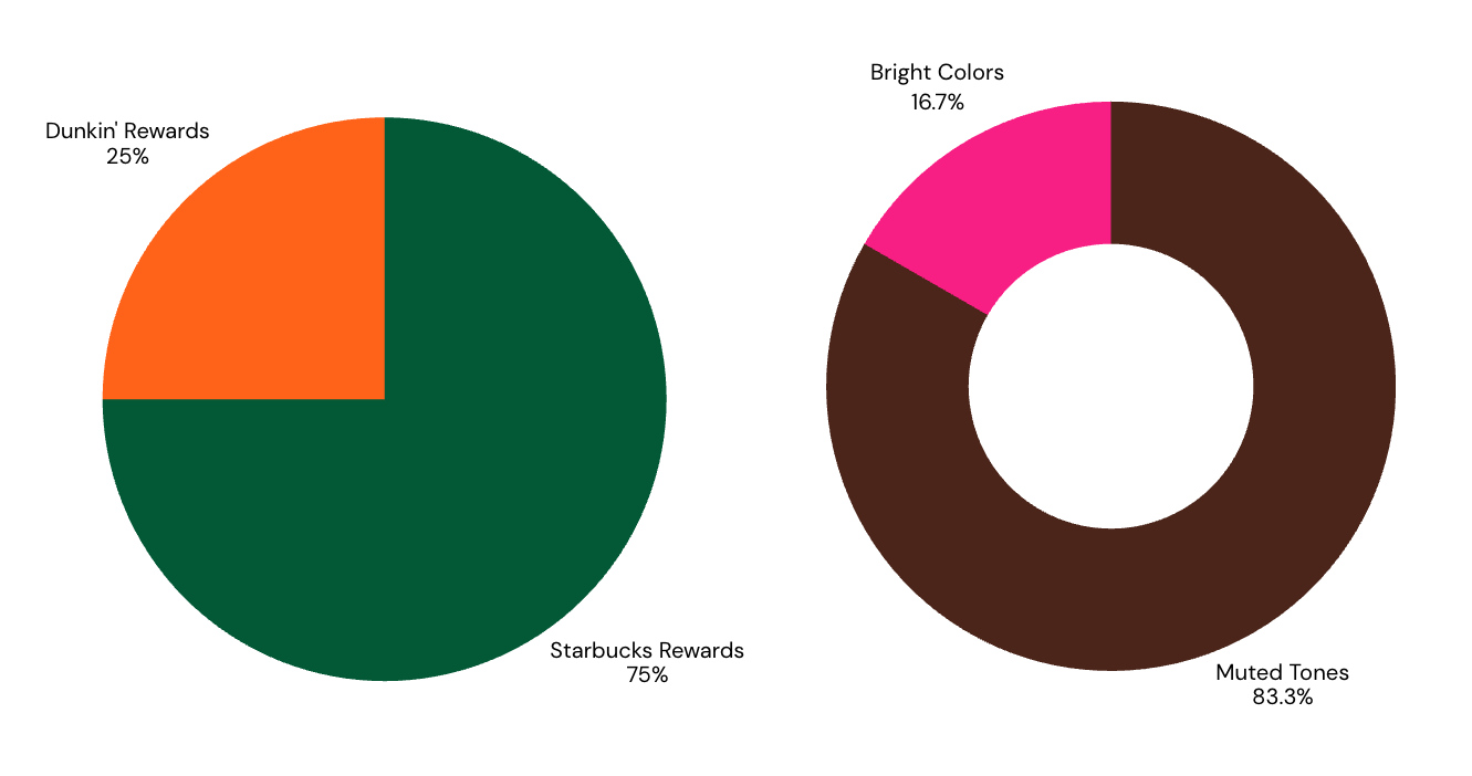
App Design Preference
Coffee Chain Color Preference
In addition to the data included in the pie charts, supplemental data I gathered from the survey revealed the following insights:
100% of respondents state that the homepage button should say “Start an order” instead of “Scan in store”
~83% of respondents note that the Starbucks app suits their color-preference more
Respondents enjoy seasonal promotions
Respondents do not like clutter, but also suggest that the app should not feel too bland either
Easy access is one of the most important components of a rewards app, which is why Dunkin’s app felt more overwhelming and cluttered
Brainstorming
To begin brainstorming my coffee rewards app, I created a personal board on Miro to layout my aesthetic ideas, as well as put my survey insights right in front of me to make it easy to pinpoint what is important to include in my design.
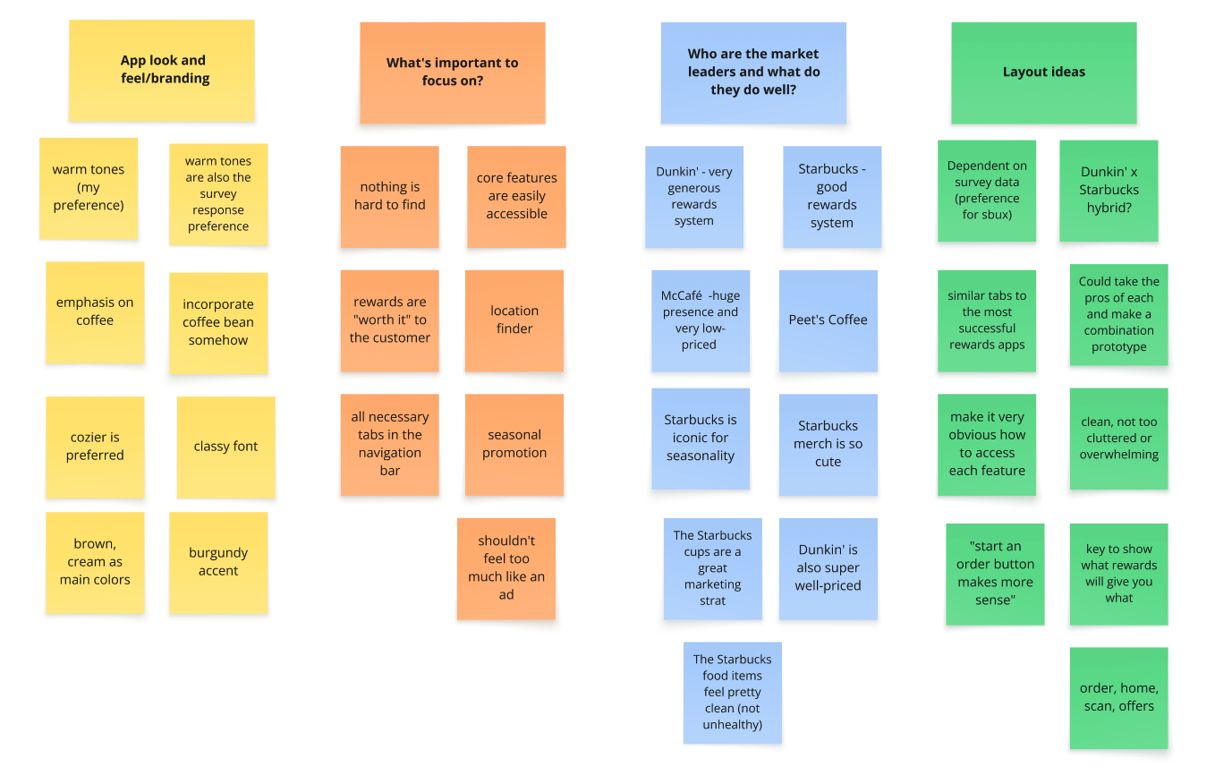
Look & Feel
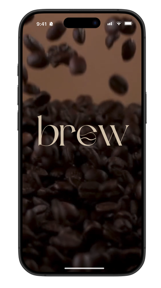
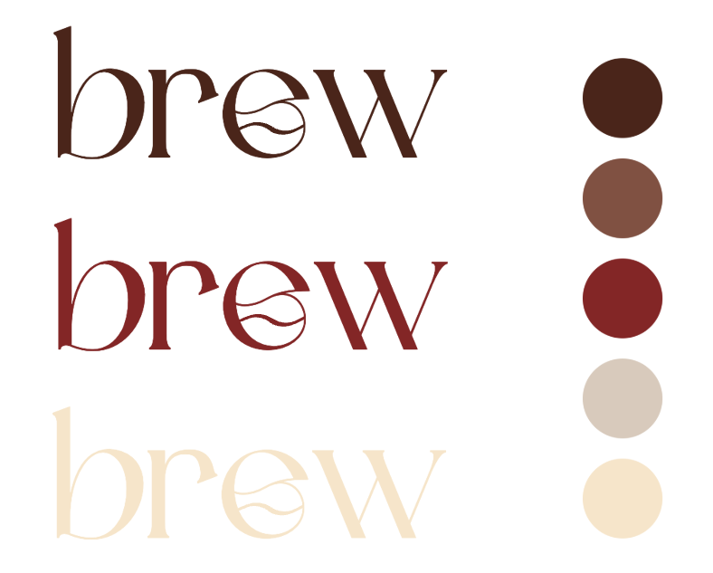
Since my survey indicated a preference towards muted tones for coffee chain colors, I decided to stick with browns, creams, and a maroon as my “stand out” color when creating my coffee chain brand. I decided to use the name “Brew”, since it is clean and simple, making it easy to remember. I chose a classy font and manipulated the “e” to resemble a coffee bean to keep it relevant to the brand. I decided to make the rewards points “beans” to remain consistent with the brand identity.
Low-Fidelity Prototyping
I spent a lot of time going through the Starbucks and Dunkin’ Rewards apps and worked on finding a “best of both worlds” design for Brew. I also kept my survey feedback in mind while creating my low-fidelity prototypes.
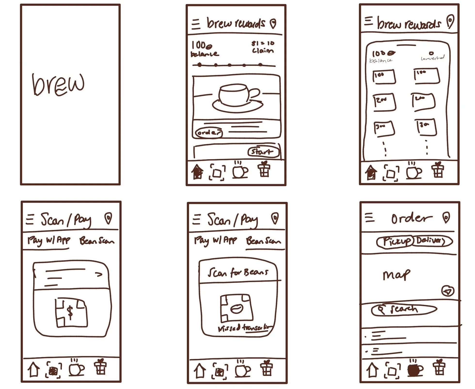
Within the 6 screens, I created the page that appears when you first open the app, then the homepage where you see your rewards status at the forefront. My survey feedback indicated that the simplistic design was desired, so I kept that in the design while also trying to make the app look a little more full.
I mimicked Dunkin’ for their rewards selection and scan/pay tab (with a few tweaks) since it was easy to follow and well-spaced.
For the ordering tab, I kept it generic and clean, making sure users have a simple experience picking their location of choice and finding everything that they need to.
High-Fidelity Prototyping
At this stage, I translated my low-fidelity prototypes into Figma.
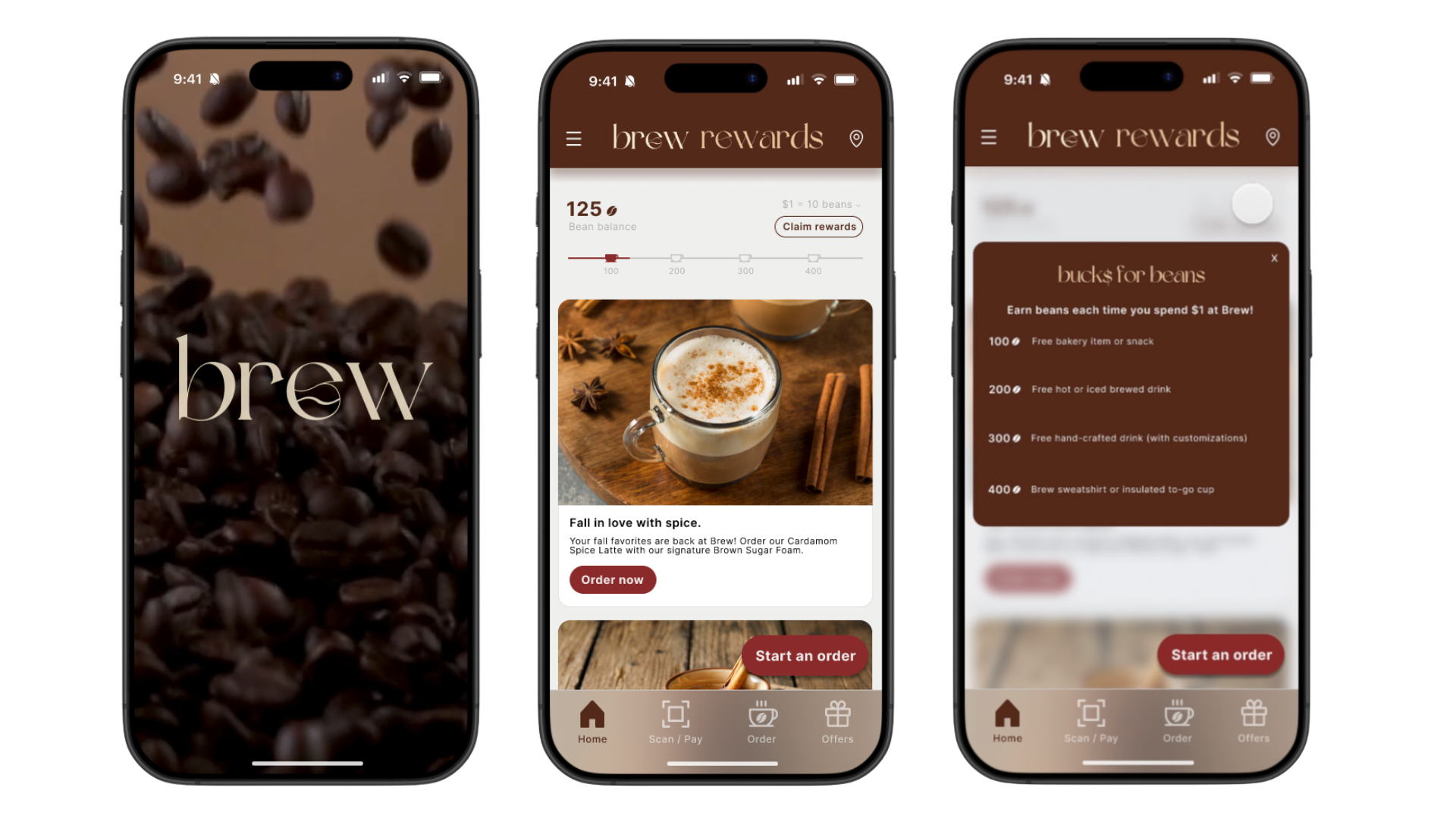
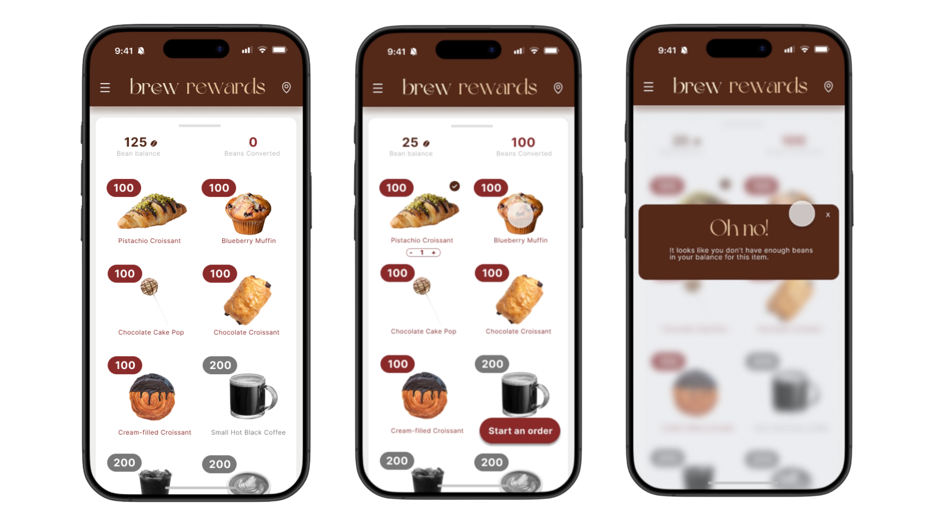
The first screen is the app entrance, which then goes to the homepage where users see their rewards at the top indicated by “bean balance”. Each milestone is indicated with a coffee mug, and the “claim rewards” button is located close in proximity for easy discoverability. If users click the arrow next to “$1 = 10 beans”, a key will pop up explaining different rewards conversions. The navigation bar is in the usual location along with universally used icons to ensure that users understand what each tab icon indicates. Seasonal promotions are front and center, along with a button at the bottom right to start an order. There is also a menu bar in the top left corner along with a location icon in the top right so that users can allow the app to find Brew shops closest to them.
App Entry & Homepage
Claiming Rewards & Feedback
After clicking the “claim rewards” button, users are directed to the select rewards screen. Users can select how they would like to convert their beans. When users select an item, a button at the bottom right of the screen will appear allowing them to start an order. An indicator will appear under the item chosen, allowing users to increase or decrease the number of that item that they order. Feedback is provided for item selection- when an item is selected, a checkmark will appear next to it. If a user selects an item and does not have enough beans for it, they will get an “Oh no!” message, explaining that they do not have enough beans in their balance. Colored items indicate that a user can select that item, while grayed out items indicate that the user does not have sufficient beans to select them.
Scan/Pay & Ordering
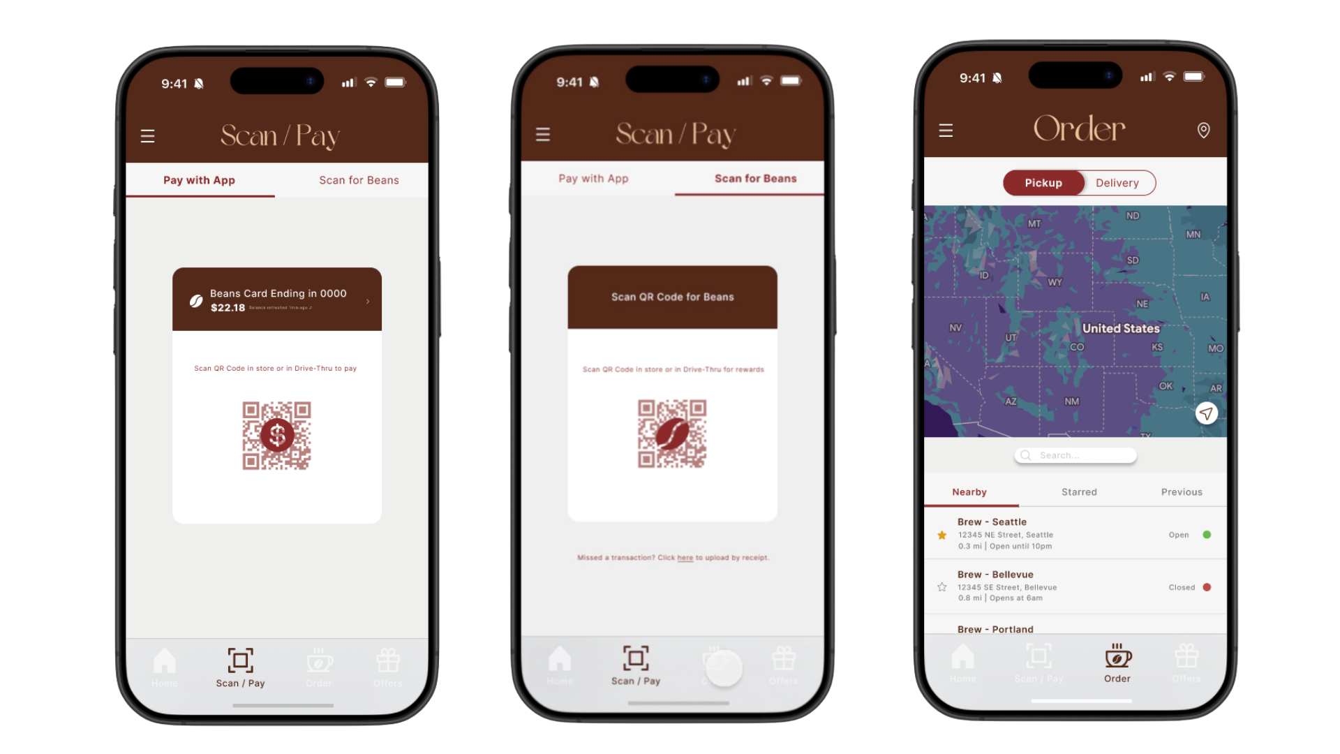
The “Scan/Pay” tab has two sections, one for app payment and the other for scanning for beans rewards. This is indicated by the tabs at the top of the screen along with the coin icon on the payment QR code and the bean icon on the bean scan QR code. Users can view their current app balance when scanning their app to pay and see the balance in their account update in real-time. The “Order” tab pulls up a map that has locations listed relative to user location. Users can view nearby locations, “star” their favorite locations and view them under the “starred” tab, or view locations that they have ordered from previously. This page also tells users which locations are open, their hours, address, and distance from users. Users can also use the slider above the map to indicate pickup or delivery orders.
Final Prototype
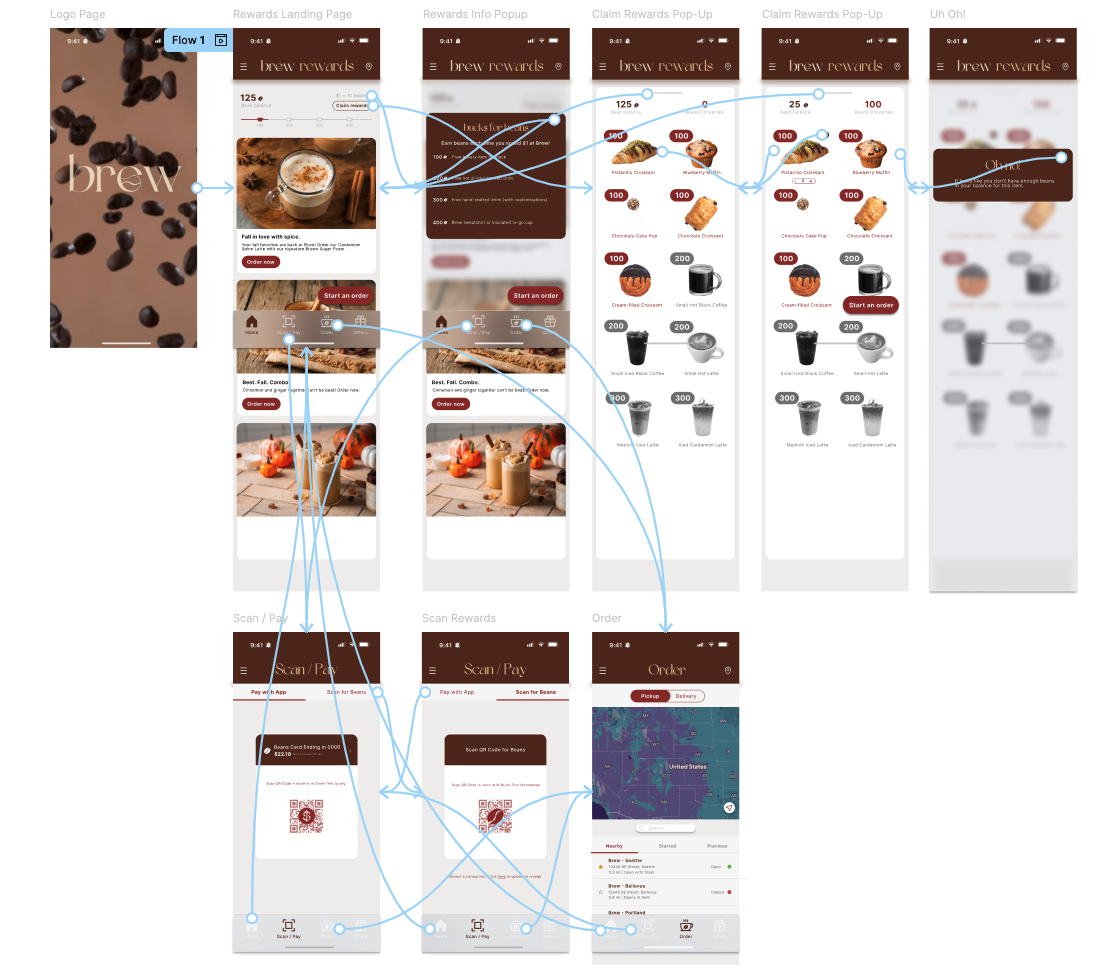
Once I finished designing all of my components and pages, I created my flows and made rewards app a functional prototype!
Thanks a latte for viewing this project!
Want to see more of my work? Click the button below!