Google Reviews
Mobile User Experience Design

This project was an individual assignment through my Graduate HCI course at Georgia Tech with the task of improving an existing digital interface of my choice.
Timeline
Tools
Figma
PeerSurvey
Google Forms
Spring 2025
5 weeks
Introduction
Google Reviews is a popular medium for finding real experiences and opinions on places that you might visit. Although popular, the current interface is interwoven with Google Maps, making features difficult to discover, along with limiting what can actually be done with the platform. There is no way to search for specific reviewers by name or see posts from accounts you follow in any sort of feed.
For this project, my goal is to improve the Google Reviews platform for users through introducing a feature that allows you to view reviews in a single tab from reviewers that you follow, while also incorporating feedback from surveys, interviews, and focus group participants.

Market Positioning & Competitors
The top websites/mobile applications for reviews currently are Google Maps, Yelp, Quora, and TripAdvisor. Google Maps is the winner in terms of accessibility to the platform, however, the biggest difference between Google Maps and its competitors is that competitors provide the ability for users to access their following feed. With this one change, Google Maps would be able to capture more users and a greater market share.

Needfinding Plan
Survey
My first needfinding activity was conducting a survey to get basic information regarding my topic and respondent demographics. My survey questions were mostly multiple choice with a few that were open ended. At the very end, I also opened up discussion for others to share their thoughts on my survey, feedback about the survey or project, or even ideas that they would like to see implemented in my project.
Heuristic Evaluation
For my heuristic evaluation, I analyzed the Google Maps and Google Reviews interfaces using three heuristics to assess the overall user experience. This evaluation will help me identify areas for improvement before moving forward with designing my prototypes.
Recognition rather than recall
Help users recognize, diagnose, and recover from errors
Consistency and Standards
Needfinding Results
Survey Results
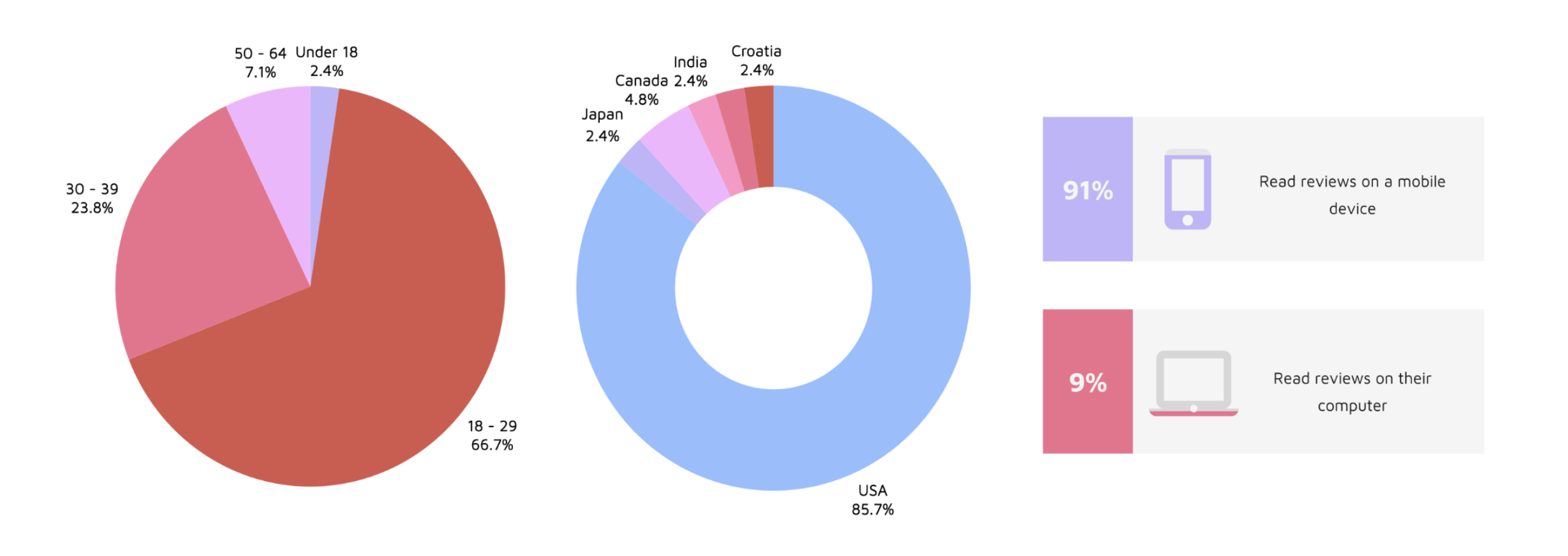
Responses were collected from 42 survey participants. From the information gathered, the following insights were recorded:
95.2%
trust reviews more when they can see that it was written by a real person
92.8%
say that reviews impact their decision on whether or not to visit somewhere
85.7%
want the ability to see content from reviewers that review places of interest
78.3%
want a tab allowing them to view content from reviewers they follow
From the collected insights, we can see that there does seem to be significant interest in a feature that would allow users to read reviews from real, trust-worthy reviewers that they are interested in in an aggregated format.
General Survey Respondent Information
Heuristic Evaluation Results
Recognition rather than recall: Google Reviews violates this heuristic since there is currently no way for a user to save reviews. This is a violation because it requires recall over recognition.
Help users recognize, diagnose, and recover from errors: Google Reviews violates this heuristic in that if a user loses a review, there is no way to find it if they forget the location. This is a violation because this could risk a user never finding that specific review again.
Consistency and Standards: Google Reviews uses consistent iconography and interactions, so it obeys this heuristic.


Google Reviews Interface Lacks Key Features
From both my survey results and heuristic evaluation, I was able to identify a few core problems with the Google Maps and Google Reviews interface. One major issue is the lack of a feature to save or bookmark reviews, making it difficult for users to reference reviews later. Additionally, while users have the option to follow reviewers, this feature appears to have little practical value, as it does not actively showcase reviews from those they follow. Another notable gap is the absence of a way to see reviews from frequent visitors of specific types of places, despite a clear demand for such a feature.
List of ideas
The full list of ideas from the brainstorming session can be found in Appendix 15.4: Brainstorming Results in the document attached at the end of this page. I chose the following ideas to move forward to the prototyping stage:
Design for mobile (most people view reviews on phone)
Tab (for quick access) for looking at reviews from people you follow
Reviewers with a star are verified (for credibility)
Recommendations, curated maps
Ability to tag someone
Specific biographies - prompt reviewers to discuss what they review
Bookmarks/bookmarked reviews page
Commenting on reviews/rating reviews
I will be designing low-fidelity prototypes for three different versions, one that includes every feature mentioned, one with fewer, and one that is very simple while still addressing the core problems.
All Inclusive Low-Fidelity Prototype

This prototype includes a new tab where users can find posts from reviewers they follow, verified reviewer indication (star) for credibility, personalized recommendations, the ability to comment on reviews, rate them based on relevance and accuracy, and tag friends for shared experiences. This design leverages engagement and gamification by introducing social and interactive elements, while affordance and visibility ensure that key functions, like verified reviewers, are easy to recognize. Users can navigate by tapping on the icons, and on the curated maps page, they can click the pins or zoom in to see the recommendations. The bookmark page showcases all of the locations that users bookmark as they scroll through their feed page of reviewers they follow.
Narrowed Low-Fidelity Prototype

The narrowed prototype refines the all-inclusive design by removing certain features to enhance usability without sacrificing essential functionality. While it retains a tab for following reviewers, verified reviewer stars, recommendations, and curated maps, it eliminates commenting and tagging features, reducing the complexity of social interactions and reducing the feeling of overcrowding- especially since this interface is a mobile design.
Users can still rate reviews based on relevance and accuracy, access the bookmarks page, and add details about their interests on their profile. By prioritizing simplicity, this version enhances discoverability and learnability, making it easier for new users to navigate while maintaining an engaging experience. However, while removing comments and tagging simplifies the interface, it may also reduce user engagement and social interaction, making the platform feel less connected compared to the all-inclusive version.
To rate a review, you can click on a review and it will enlarge. When you scroll down, you will find a section to rate the review for three categories: relevance, accuracy, and helpfulness. You can rate each category in the same way you would provide ratings in a normal review to promote consistency. Users can also like reviews by tapping the heart underneath it. The bookmarks and curated maps pages work the same way as in the all-inclusive prototype.
Simplistic Low-Fidelity Prototype

The simplistic prototype strips the design down to core functions, ensuring a clean, focused, and highly usable interface. It includes the most essential features: a tab for following reviewers, verified reviewer indicators, personalized recommendations, a bookmarks page, and a profile section where users can describe their review interests. This version adheres to Jakob Nielsen’s heuristic of aesthetic and minimalist design, eliminating distractions and reducing cognitive load.
With fewer features, the learning curve is shallow, making the platform more accessible to all users. Users can complete actions quickly without unnecessary friction. The comments and rating reviews features were removed with the reasoning that everyone’s experiences are unique, so it might be biased or incorrect for people to rate other people’s experiences on accuracy, relevance, etc. Additionally, location owners could take advantage of the rating reviews feature and give the negative reviews bad ratings, and this could harm the integrity of reviews as a whole.
Users can scroll through the “Feed” page to like and bookmark reviews they find useful or interesting. You can click on the bookmark icon in the navigation bar to access the “You” page where you can then see personalized recommendations as well as a way to access your bookmarks. When you click on the bookmarks tab, you will be taken to a bookmarks page.
Quantitative & Qualitative Evaluation Results
Participant Recruitment Outcome
From asking on Instagram alone, I was able to recruit 7 participants for the think-aloud protocol, interview, and post-interview survey. All of them were familiar with Google Reviews prior to the study. I conducted all of the sessions virtually, sending the instructions to participants beforehand, but made sure to go over them again during the video call.
Quantitative Analysis Results
The following section provides key insights regarding error rates and post-interview survey results from all of the participants. I have broken it down into sections by prototype. From these insights, we can see that Prototype C had the fewest errors on average, as well as the highest usability and effectiveness scores. I also asked one quantitative question during the interviews regarding which prototype each participant enjoyed using most, and 85.71% (6/7) of participants said that they prefer Prototype C the most.
Prototype A
Averages
Error count: 3.86
Usability score: 52.38%
Effectiveness score: 38.1%
Time to get through: 1 min 46 sec
Prototype B
Averages
Error count: 2.29
Usability score: 85.71%
Effectiveness score: 61.9%
Time to get through: 1 min 31 sec
Prototype C
Averages
Error count: 1.29
Usability score: 95.24%
Effectiveness score: 100%
Time to get through: 1 min 13 sec
T-Test Results Summary
Prototype A had significantly more errors than Prototype C, with an average difference of 2.57 more errors, indicating that users made noticeably more mistakes using Prototype A. However, there was no significant difference in error counts between Prototype A and Prototype B or between Prototype B and Prototype C, suggesting that while Prototype B had fewer errors than Prototype A and slightly more than Prototype C, these differences were not statistically meaningful (but this is likely due to the small sample size). Overall, Prototype C performed the best, with the fewest errors, while Prototype A had the highest error count, making it the least effective in terms of reducing user error.
Qualitative Analysis Results
Regarding the sentiment analysis, it seemed as though the participants were the most relaxed when using Prototype C (the simplistic low-fidelity prototype) as it was the least overwhelming to use since it had the fewest amount of features.
The thematic analysis revealed key insights about cognitive load, interface clarity, and ease of navigation.
For Prototype A (all-inclusive low-fidelity prototype), participants share the notion that the feature to leave reviews on reviews could be a bit much. They make comments about the crowded nature of the “Feed” page, but mention that overall the navigation is okay. Participants navigated the slowest through this prototype.
For Prototype B (narrowed low-fidelity prototype) the consensus was that it was mostly easy to navigate, and seemed preferable over Prototype A, although the rating reviews feature was not very popular.
Prototype C (simplistic low-fidelity prototype) seemed to be the most popular, having the most simple and easy to follow interface. There was a comment on including text next to the icons in the navigation bar, but this was a common thought shared across all of the prototypes dependent on which one was seen first (for example, someone had the same thought if they saw Prototype A or B first, but after you see one prototype, you will understand the navigation bar of the next one you see- this is why I stressed the importance of randomized order when it came to letting participants look at each prototype).
Across the interviews, some of the key insights noted were that, although users may like more features, they might not use all of them, and also would prefer a cleaner interface over a cramped one. Prototype A was noted to have been the “most confusing” prototype to use out of all three, and participants suggested adding text for clarity, and removing the rating reviews feature. They also liked the idea of the bookmarks page being attached to the “You” page (as presented in Prototype C). Additionally, I noted that participants found that the “recommendations” and “curated maps” features were quite similar, so it might be redundant to include both.
Final Prototype (Medium Fidelity)
Figma Flows
Flows created during this project in Figma going through each of the designed features and pages
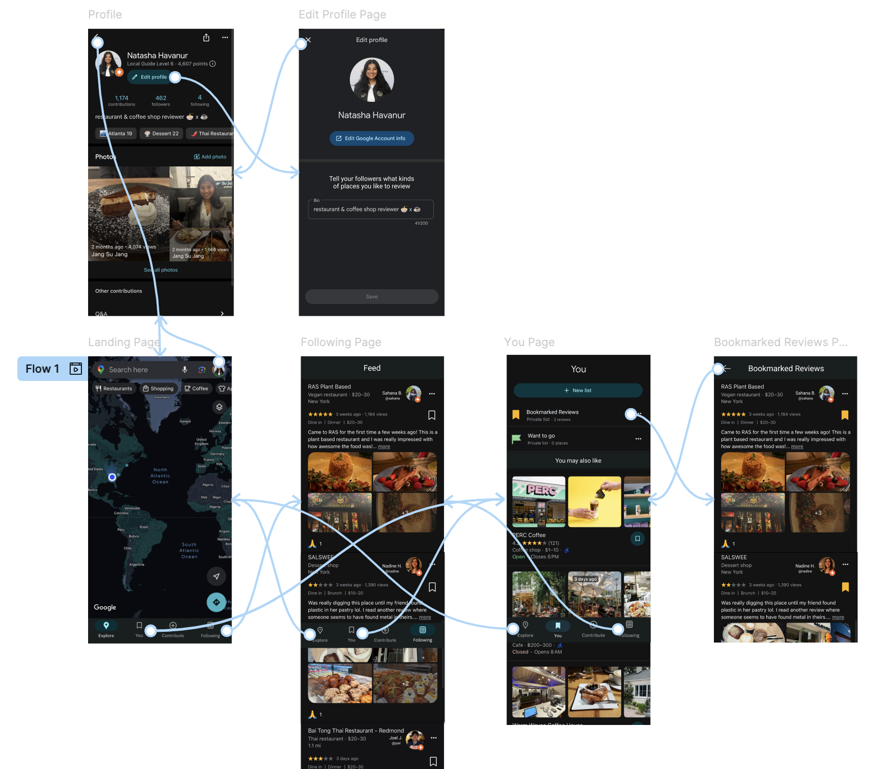
New Tab on “Landing” Page
From data collected during my needfinding process, I found that most people read reviews on a mobile device (which is why I proceeded with the mobile design), meaning that users likely read reviews on-the-go or want to do it in a fast manner, which calls for quick access.
Adding a tab to the navigation bar on the landing page for “Following” helps with finding reviews quickly. I decided to keep the “You” tab on the navigation bar so users can also find saved reviews and locations quickly as well.
“Following/Feed” Page
The “Following/Feed” page showcases a novel way to read reviews. From the think-aloud protocol, interviews, and post-interview surveys I found that reducing clutter was important, so I made sure the interface looked as minimalistic and clean as possible. Additionally, I removed the ability to rate reviews to reduce complexity and confusion and promote diverse experiences.
Study participants in both the needfinding portion and prototype testing liked the feature that showed verified reviewers (reviewers with a certain number of high-quality reviews), so I kept this feature. I put the star right next to the reviewer’s profile photo so it is obvious who the verification belongs to (grouping by proximity). Currently, the star feature on Google Reviews refers to a reviewer’s “level”, but I have changed this to refer to verification status.
Enhanced “You” Page & “Bookmarked Reviews”
The “You” page was well received when it had the recommendations integrated within it. Additionally, it was easy to find bookmarked reviews from this page as well as finding saved locations to view later. For these reasons, I went ahead and kept the design relatively similar to the Prototype C version.
The biggest difference in this prototype versus Prototype C was making the text a little more descriptive to provide more clarity. I kept the “bookmark” icon to maintain consistency and also kept in mind that the “bookmark” icon is widely used and recognized across various platforms and online tools. When you tap the “Bookmarked Reviews” section, it takes you to a page with the reviews that you bookmarked from the “Following/Feed” page.
Modified “Edit Profile” Page
From my needfinding, I was given the recommendation to include a feature that allowed users to see what kinds of content that reviewers write, which was later received very well in the low-fidelity prototype walk-throughs and interviews.
In the figure below, you will see a prompt that says “Tell your followers what kinds of places you like to review”. This encourages the development of community, and can help users find reviewers that post reviews that are of interest to them. For example, if someone is only interested in coffee shops, they might choose to follow a reviewer that has “Coffee Shop Reviewer” in their profile’s biography.


Video Prototype
The embedded video below will play a narrated video by me where I go through my functional prototype that I created on Figma (video also accessible through the link below):
Final Evaluation Results
The full responses to the interview questions can be found in Appendix 15.11: Final Evaluation Interview Responses in the document attached at the end of this page.
Final Participant Recruitment Outcome
From using my personal network, I was able to recruit 5 participants. All of them had familiarity with Google Reviews and have used it in some capacity before. All of them participated in watching my prototype video and then responding to seven post-video questions in a live interview format. Three of the interviews were conducted online through Zoom due to location, while two were conducted in-person.
Final Qualitative Evaluation Analysis Results
Using a thematic analysis approach to examine the qualitative results, I found that all participants expressed enthusiasm for the new features, particularly highlighting their appreciation for the feed tab, which allows them to seamlessly scroll through reviews from reviewers whose tastes align with their own.
Participants unanimously agreed that they would find the new features valuable and envisioned using them primarily to discover new places of interest. Notably, three out of the five participants specifically mentioned that they would use the platform to find new restaurants local to them, reinforcing the idea that the feed tab and recommendation system cater well to users seeking personalized discovery experiences.
As a point of constructive feedback, two out of the five participants suggested making a visual distinction between the "You" page icon on the navigation bar and the "Bookmarks" icon. They felt that the similarity between these icons could potentially lead to confusion (although once you click on the “You” tab it is very clear what to do) and recommended adjusting the design to improve clarity. This feedback underscores the importance of intuitive navigation and suggests that even small design changes can enhance the overall user experience. Although they provided this feedback, they did not think that this small issue made the interface difficult to use at all.
Final Quantitative Evaluation Analysis Results
To collect quantitative data, I asked three quantitative questions during each of the interviews. Below are the average scores for each of the questions:
Average ease of interface navigation (1 - 5, 5 being the best): 4.9
Average usefulness of new features (1 - 5, 5 being the best): 5
Average confidence in navigating interface alone (1 - 5, 5 being the best): 5
All of the values were 5 or close to 5, and the scale was from the range of 1 - 5. From these qualitative results, we can conclude that the participants found the interface easy to navigate as well as thinking that the new features are useful. They also note that they would feel confident navigating this platform without any assistance.
Final Analysis Takeaways
An in-depth review of both the qualitative and quantitative data from the final evaluation reveals a strong overall sense of user satisfaction. Participants consistently conveyed that the interface felt intuitive, straightforward, and easy to navigate, with many emphasizing its simplicity as a key strength.
Although there is always some room for improvement, like changing the “You” page icon to something that can be differentiated from the “bookmark” icon, overall, we can see that this positive feedback, combined with the supporting metrics, suggests that the final prototype successfully balances functionality with a clean, user-friendly design.
Full Project Report
The following file contains my entire in-depth project report, including the appendix, specific survey insights, T-Test/other collected data, and information on iterations. If you are interested in learning more about the specifics of my project, feel free to take a look!
Thanks for reviewing this project!
Want to see more of my work? Click the button below!